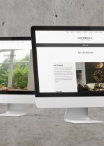
Minton-Spidell recently changed ownership and the new management wanted a complete refresh of their digital image. Along with social media and email promotions, we updated the website to provide updated options to the website like large images, easy to browse product catalogs, and dynamic tear sheet generation.
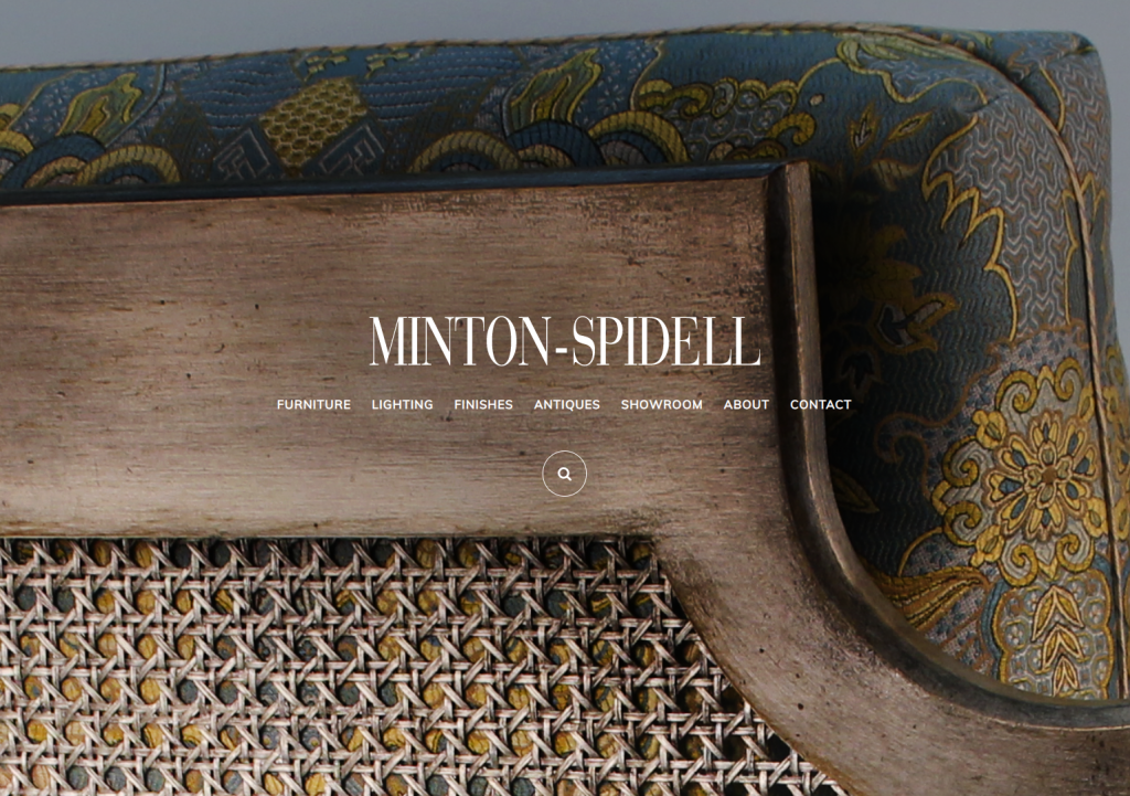
01. Bold Entrance
The initial site creates a bold peek into what is in store for the rest of the product. Showcasing a beautiful wood finish and striking upholstery.
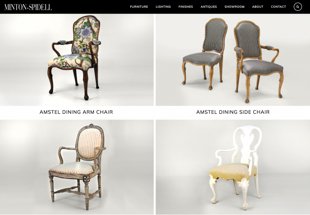
02. Infinite Scroll Catalog
Within each product category, the user experiences an infinite scroll of product images. Easily allowing a user to scroll through the catalog to find what they are looking for. Users who need a way to quickly reference a specific catalog can search the website by product name or item number too.
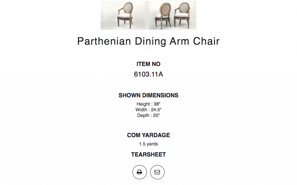
03. Useful Product Information
Easy access product information like standard dimensions, item number, COM and the ability to print a tear sheet are must-have features for the interior design trade consumer. We’ve presented them in an easy to use manner with flexible design in desktop, tablet or mobile.
05. Make It Pop
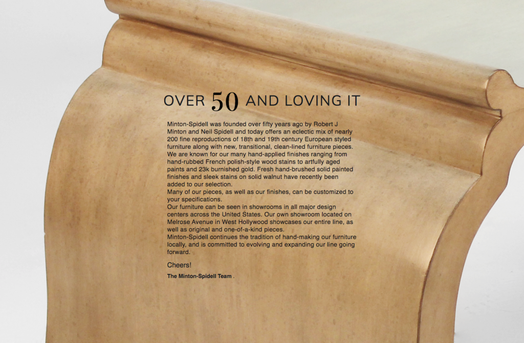
Pages with lengthy text like the about page are still a chance to showcase beautiful finishes for a furniture maker. Full-page image backgrounds allowed us to describe the company with visual impact.


